ShopDreamUp AI ArtDreamUp
Deviation Actions


Description
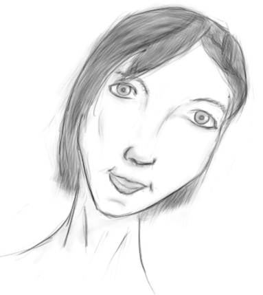
I wanted to draw from a reference picture and it didn't turn quite how I expected it  That's part of learning.
But there's something about her eyes that I like
 That's part of learning.
But there's something about her eyes that I like

Image size
383x429px 68 KB
Comments4
Join the community to add your comment. Already a deviant? Log In
On behalf of  !
!
This is a very interesting peice! I like how the title correctly describes the picture. Her gaze is very strong.
There have few problems with the face that shouldn't be too hard to fix. The way you placed the features if the face seems off. I'm not sure if you drew the face, then the features or if you drew it from top to bottom, however i recommend when drawing the face you start off with a circle. All of the features should fit inside that circle. Then you can add the chin but extending the circle at the bottom a bit.
Why do i reccomend you start with a circle? The way you drew it seems you went ahead and just drew the overall shape and tried to fit everything on there so that all the space is used. This is ouvbious when I first noticed the nose. It seems a bit too long, and i dislike this because it makes the overall face seem awkward. I also noticed the right side of the nose is missing the nasolabial fold. I'm not sure if this is intentional and you wanted the face you have a side view, but the rest of the face is facing forwards and having a nose facing a different direction is confusing. However, I like how the nose follows the eyebrows like a face should! This makes the face seem more realistic.
Speaking of eyebrows, your eyebrows seem rounded. Next time, try to draw the eyebrows arching up and when you reach the 3/4 mark, arch it down. This isn't a hard fix though, and your eyebrows are already placed well so there is no need for moving them around.
The eyes seem too far apart, and it looks a bit awkward. Since the face is facing forwards, the eyes should be parallel to each other and have the same distance from the nose. I would recommend moving them a bit closer to each other. The also seem a bit droopy, this might be intentional, but if it wasn't, lifting them up is an easy fix.
The last few things are quick fixes. I dislike how the mouth frown lines are facing the wrong way. They should be flipped around. Also, the chin crease is way too below the mouth. It show be right underneath the bottom lip. These are just tiny things take take away the realism away from the drawing, and if fixed, would give a bigger sense of realism and make the drawing stronger.
Lastly, ears! I understand why you wouldnt want to draw ears. I hate drawing them aswell, but the hair is thin enough for the ears to be peeking through them. It may be hard drawing them, but you'll never learn if you never try!
Some strong points that I like are the hair. The strands all flow nicely into one direction and they don't end choppily. It also frames the face nicely, giving it more sense of an realistic face.
Good luck with drawing in the future, and sorry for rambling. I hope I was helpful.
Also, check out project comment. They make sure you get constructive criticism that will improve your ability to draw!
!This is a very interesting peice! I like how the title correctly describes the picture. Her gaze is very strong.
There have few problems with the face that shouldn't be too hard to fix. The way you placed the features if the face seems off. I'm not sure if you drew the face, then the features or if you drew it from top to bottom, however i recommend when drawing the face you start off with a circle. All of the features should fit inside that circle. Then you can add the chin but extending the circle at the bottom a bit.
Why do i reccomend you start with a circle? The way you drew it seems you went ahead and just drew the overall shape and tried to fit everything on there so that all the space is used. This is ouvbious when I first noticed the nose. It seems a bit too long, and i dislike this because it makes the overall face seem awkward. I also noticed the right side of the nose is missing the nasolabial fold. I'm not sure if this is intentional and you wanted the face you have a side view, but the rest of the face is facing forwards and having a nose facing a different direction is confusing. However, I like how the nose follows the eyebrows like a face should! This makes the face seem more realistic.
Speaking of eyebrows, your eyebrows seem rounded. Next time, try to draw the eyebrows arching up and when you reach the 3/4 mark, arch it down. This isn't a hard fix though, and your eyebrows are already placed well so there is no need for moving them around.
The eyes seem too far apart, and it looks a bit awkward. Since the face is facing forwards, the eyes should be parallel to each other and have the same distance from the nose. I would recommend moving them a bit closer to each other. The also seem a bit droopy, this might be intentional, but if it wasn't, lifting them up is an easy fix.
The last few things are quick fixes. I dislike how the mouth frown lines are facing the wrong way. They should be flipped around. Also, the chin crease is way too below the mouth. It show be right underneath the bottom lip. These are just tiny things take take away the realism away from the drawing, and if fixed, would give a bigger sense of realism and make the drawing stronger.
Lastly, ears! I understand why you wouldnt want to draw ears. I hate drawing them aswell, but the hair is thin enough for the ears to be peeking through them. It may be hard drawing them, but you'll never learn if you never try!
Some strong points that I like are the hair. The strands all flow nicely into one direction and they don't end choppily. It also frames the face nicely, giving it more sense of an realistic face.
Good luck with drawing in the future, and sorry for rambling. I hope I was helpful.
Also, check out project comment. They make sure you get constructive criticism that will improve your ability to draw!